Why I Made The Switch To Showit From Squarespace
Never say never! For those that have been following my journey, you know I have always been a big Squarespace fan… but when I discovered Showit as an option, I was intrigued. After signing up for a free trial and playing around with the platform, I knew immediately that I had to make the switch to Showit from Squarespace… and it has been the best decision ever.
Ok, let’s back up. What exactly is Showit?
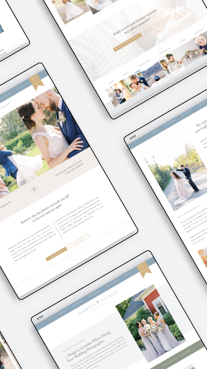
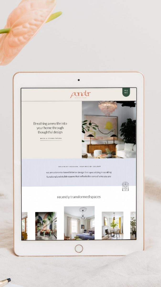
Showit is a visual “drag-and-drop” website builder and hosting platform that allows you to create a custom-designed website for your business. Primarily created for photographers, creatives and service-based businesses around the world now uses this intuitive tool to build their digital home. It is known as “the” platform that married design and blogging beautifully.
When I first launched my business, I chose to build my website on Squarespace because of its ease of use and intuitive platform. It just made total sense based on my needs at the time. I had some previous experience editing a WordPress template and thought it was pretty complicated, so when I came across Squarespace, it just seemed like the right choice. And over time, I learned a bit of CSS to help with customization but half the time, I would be pulling my hair out trying to figure out what is (or isn’t) working.
As a brand and website designer, one of my goals is to help you pick the right platform for your digital home so that you can thrive online and be able to attract the right people into your business through strategic design. That’s not to say Squarespace is not a great platform – in fact, I truly believe they are all great. It comes down to which platforms is the best for you and can help reach your goals.
Today, I want to share the top five reasons why I made the switch to Showit from Squarespace:

Drag & Drop Builder (Code-Free!)
We have all probably heard this phrase thrown around… in fact, I’d say most platforms claim that they are a “drag and drop builder”… but I would say that the real platform that can stand behind that statement is Showit.
Showit offers a lot of free templates, which allows you to set the base foundation of your website. What’s great about the templates is that you have the ability to customize them in any way that you want to match your brand identity and create a memorable experience for your users. Did I mention it’s code-free?
While Squarespace 7.1 does offer a similar option, you are presented with various layout options, but you are limited to what you can design if you don’t know any coding or CSS. That’s when all Squarespace sites start to look very similar to one another. Not to mention, you are pretty pinned down based on the colour palette system that is determined in the site styles builder throughout the entire site.
Which leads me to the next point…

Creative Design Freedom
Because of its drag-and-drop functionality, the creative freedom that you have is limitless. I’ll be honest – it took me a bit of getting used to because I was so used to building websites in a “grid-block” hierarchy that Squarespace offered. It has really pushed me to think outside the box in terms of layouts and understanding how to display information in a more unique and distinct manner.
For designers reading this – I should also mention that it is very similar to designing in Adobe Illustrator or Adobe XD, in a sense where you are working with multiple layers.
I would definitely recommend working with a website designer if you don’t have previous design experience or aren’t considered tech-savvy… just because working with a blank canvas can be pretty intimating! Or if you are on a smaller budget or timeframe, there are a lot of Showit web designers that offer premium templates options.
All that to say… anything you desire can pretty much be created and brought to reality with Showit!
Better Mobile User Experience
Let me hit you with a quick stat – did you know that 57% of website traffic comes from mobile devices? That’s an astronomical number and one that will keep increasing. What I adore about Showit is that you can create a separate mobile design and navigation experience for your visitors so that it is more optimized for their journey… whereas, in Squarespace, you are locked into their responsive design without much flexibility to change. And I can tell you, it’s not always 100% responsive in the way that you want (lesson learned!).
Let’s face it – the way we consume information on our desktop and mobile devices are completely different… which is why we have to consider “mobile-first” when designing. It’s no longer an after-thought.
In Showit, you have the ability to design and edit both the Desktop and Mobile interface side by side so that you can create a powerful user experience no matter the screen size. This makes your visitors’ experience that much more strategic and powerful.

SEO Optimization & WordPress Blog Integration
We all know how SEO is an important factor to consider when creating a website that is optimized and high-converting. And truth is, SEO doesn’t discriminate with platforms, but more with the content you decide to put on your website.
Both platforms offer SEO capabilities where you have the ability to change the SEO titles, meta descriptions, and heading tags on each page and canvas of your website. On Squarespace, you do have the additional ability to update an image’s name after uploading it onto the platform whereas, on Showit, you have to change it before uploading.
However, what puts Showit ahead in this race is its’ integration with WordPress blogging. When subscribed to their basic or advanced blog plan, you can instant access to the infamous “Yoast SEO Plugin” which is a gift from the blogging gods. It’s a great way to use keywords within your blog posts effectively if you aren’t too familiar with SEO 101. Additionally, you can integrate more plugin options to optimize your blog to its maximum effort.
Top-Notch Customer Support
I have to give props where props are due because Showit support is pretty incredible. You don’t have to wait days for an answer and 99% of the time, they have a response for you. It’s a tight-knitted support group so you get familiar with the people that you are talking to as well which is always neat in the online community! They primarily work office hours on weekdays via live chat; however, they do have an emergency hotline set up for the weekend just in case all hell breaks loose.
And if by any chance you aren’t able to get a hold of support, there is also a pretty fantastic and a Facebook group with tons of helpful resources and eager users ready to help! Or you can take a peek at their help documentation which is pretty detailed with video training and more.


Who’s Showit for?
- If you are a service-based business owner looking for a unique and high-converting website that embodies your personality and helps you stand out in the industry
- If you value design and don’t mind doing a bit more legwork to get your website to where it needs to be without needing to ever learn how to code
- If you are a blogger or influencer that uses blogging as a primary stream of marketing and revenue-generation
- If you ever need to create subdomains of your main site for a fraction of the price. +Sites are fantastic options if you are looking to build out a custom site for templates, workshops, courses, or any other branch of your business that requires a different look and feel
Who’s Showit not for?
- If you are looking more for a “one-stop-shop” platform where you don’t have to necessarily piece-meal together various plug-in’s or features for your website
- If working on a blank canvas intimidates you… because sometimes design freedom ends up being more of an “oh no” than a “hell yes”! Remember, looks aren’t everything.
- If you are a product-based business and require more functionality and features for your eCommerce storefront… while Showit does integrate with WooCommerce and Shopify Lite, you are probably better off with Shopify
- If you don’t have care for design or have the time to learn a new platform. The learning curve does take a bit of time to get used to and it is more of a manual process to create something unique.
Interested in trying Showit out? You can sign up for a 14-day no-obligation trial to test out the platform. Use this link and you will also be able to get one month free on your subscription. If you are interested in Squarespace, note that I am very much still a Squarespace Circle member and can help you elevate your digital home!
Ready to take your website to the next level? Learn more about my services here or schedule a time for us to chat!
—
Disclaimer: I sometimes include affiliate links within my posts. If you click and purchase, I may receive a small commission at no extra cost to you.
Paragraph
Calling all nutritionist coaches!
Meet The Full Sales Page Copy & Design Template Duo
Everything you need to finally launch your nutrition program with clarity, confidence, and personality. With copy fill-in-the-blanks, a drag-and-drop Showit template, and video walkthroughs, this is your done-with-overwhelm, ready-to-sell sales page template.
Shop Showit Website Templates
No Coding • Drag & drop • SEO optimized
Someday
Editorial, Edgy, Minimal
View demo
Joelle
Artistic, Striking, Refined
View demo
Beauté
Clean, Minimal, Refreshing
View demo
Designed By Yours Truly 🤍