How to Create a Strategic Mood Board for Your Business
Ever wondered how to create a mood board that actually evokes emotions? You have probably seen them around Instagram or Pinterest. But what exactly is it, how do you curate one, and how does it serve a purpose when building your brand?
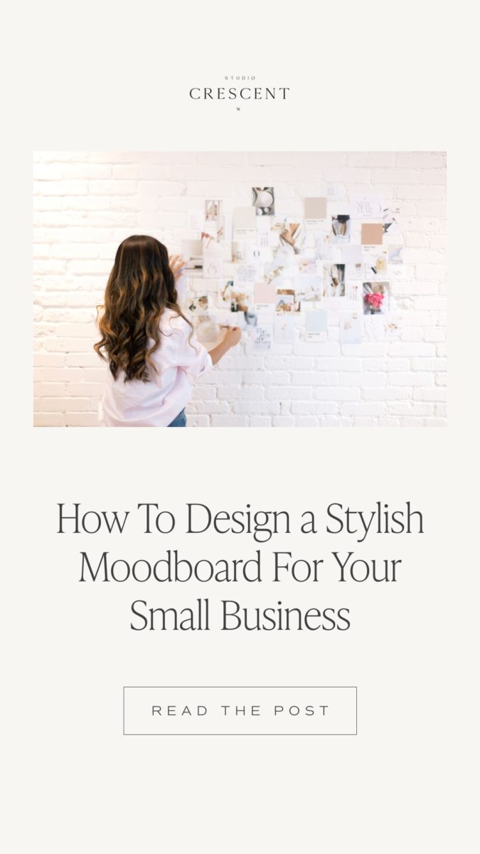
A mood board (also known as an inspiration board or direction board) is a collection of images that are strategically displayed together to bring forth a feeling. Not only is it a crucial step in the branding and design process, but it sets the mood for your brand as well as the overall direction you are looking to take.
Why do you need a mood board?
Designing a mood board is a fantastic way to curate a “mini experience” of a brand prior to getting down and dirty in the designing stage. In fact, it’s one of my favorite steps because possibilities are endless – as long as we are being strategic to the brief. When it is compiled correctly, it serves as a guiding light to curating a unique, memorable, and impactful brand.
What does a mood board consist of?
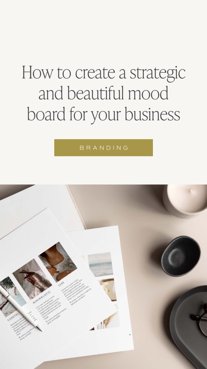
Great question! While it can be so tempting to fall down the rabbit hole and save every single picture you like on Pinterest or a stock photo website, there is actually a strategic way to compile a beautiful mood board. To start, here are some elements I like to mix and match:
- Imagery relevant to your brand
- Lifestyle imagery
- Textures & Patterns
- Emotions + Personality
- Typography
How do you create a strategic moodboard? Here’s my 4-step approach that I use with my clients!

Research
First and foremost, I like to ask my clients to complete a brand questionnaire. This will allow them to get into the right mindset prior to looking at images or logo inspiration on Pinterest or Instagram. My in-depth branding questionnaire is meant to get them thinking about their brand as a whole – from mission to values, messaging to emotions. This will also help identify the key descriptive words we want the brand to evoke.
Related post: 50 Creative Adjectives To Establish Your Brand Personality
After they have a chance to complete the brand questionnaire, we hop on a strategy call to dive even a little deeper into their ideal client, sales journey, and current market landscape. Having that overarching view is key when developing a cohesive and strategic mood board.
Collect
Now that we have solid foundations and answers from their brand, we can move on to a more visual step. This is where I create a collaborative Pinterest board with my clients and ask them to pin or upload any imagery that speaks to them and define their brand visually.
The key to a collaborative board? Asking my clients to describe WHY they have chosen that specific image and how it relates back to their brand. I find that when I am asking them to explain a bit more in detail, it will also prevent them from wanting to pin everything from their kitchen sink to their grandmother’s purse on their board. After all, the intention is key!
Related post: Why Your Business Needs More Than One Logo
Refine
Once we have a full Pinterest board filled with images, it’s time to refine and narrow down the concept. During this step, I like to create sub-boards and categorize each image to a different bucket, specifically the elements I mentioned above.
- Imagery relevant to your brand
- Lifestyle imagery
- Textures
- Patterns
- Emotions and Personality
- Typography
This process will also allow me to see if most of the images selected are cohesive or centered around a similar “theme”. If there are images that are standing out oddly or not aligned with the overall aesthetic, I remove them from the board! And if there are gaps in any of the areas, I will also be able to look at each bucket a little more holistically.
Compile
Last but not least, I go into Photoshop (or Canva) to begin compiling all of the images to curate a cohesive mood board. This process does take some time to find images that are cohesive in terms of color palette and style. I try my best to ensure I include one or two images per category above so that there is a balance in the overall mood board concept. From here, I would be swapping images in and out for hours to find that perfect fit.
Remember, perception is reality. A successful brand is only successful when what others think, feel and perceive you as is the same as what you are putting out. Therefore it is fairly crucial to not rush this step when you are building that “mini experience” of your brand!
There are different mood board templates that you could use but my favorite is the 3 x 3 since I find it the most visually appealing and clean to look at!
And voila! That’s it!
LIKE THIS POST? PIN & SHARE IT!


YOU MIGHT ALSO LIKE THESE!
Paragraph
Calling all nutritionist coaches!
Meet The Full Sales Page Copy & Design Template Duo
Everything you need to finally launch your nutrition program with clarity, confidence, and personality. With copy fill-in-the-blanks, a drag-and-drop Showit template, and video walkthroughs, this is your done-with-overwhelm, ready-to-sell sales page template.
Shop Showit Website Templates
No Coding • Drag & drop • SEO optimized
Someday
Editorial, Edgy, Minimal
View demo
Joelle
Artistic, Striking, Refined
View demo
Beauté
Clean, Minimal, Refreshing
View demo
Designed By Yours Truly 🤍