4 Logo Variations Every Brand Needs To Thrive
In this post, you will learn the reasoning behind having more than just one logo for your brand identity! In addition, we will go over the most common logo variations every brand should have and how they are applied.
You must be thinking… “Wait, did I read that right? Should my business seriously have more than one logo? Isn’t that going against the business and design gods?”
Okay, so let me back up for a second here. When I say more than one logo, I mean having logo variations for your brand identity. Your brand identity is made up of all the visual elements of your brand. It takes into consideration your business values, personality, ideal client, and much more and translates it into an identity that portrays who you and your business are.
What is a logo variation and why do I need them?
Simply speaking, a logo variation is your primary logo rearranged into another layout. They are versatile, cohesive, and complementary to one another. They are meant to be recognizable in any format that you use them.
Having just one logo is never enough when it comes to building your successful business. Each logo variation serves a different purpose and it’s important to have options that you can choose from. The last thing you want for your brand is a “one-size-fits-all” solution, because truth is, that ironically solves nothing for you.
Let’s dive into the four most common logo variations you need for your brand identity:
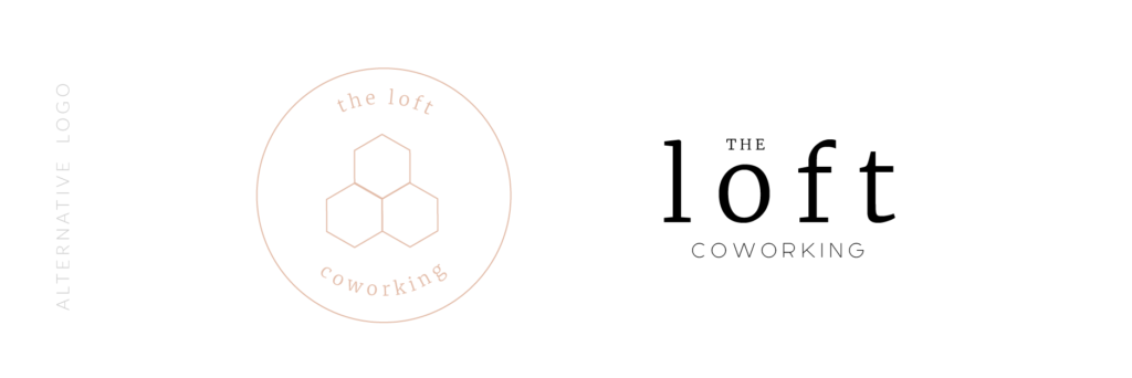
Primary Logo
Think of this as the main logo for your business and is the identifying mark that your clients recognize. It is the cornerstone of your brand identity and can comprise your tagline, illustration, and more. It sets the overall tone of your branding
Where to use it? Website header, signage, and main printed materials (magazines, brochures, etc.).

Alternate Logo
The alternate logo is a more compact and refined version of your primary logo. It would not have all of the details and elements but the most important ones rearranged in a simpler way. It is usually used in places of restricted width or height.
For example, if your primary logo is written out in one line, your alternative logo might be stacked or circular, thus giving your more flexibility to use in other marketing collaterals.
Where to use it? Business cards, invoices, and freebie downloads.
Related post: Branding or Just A Logo?
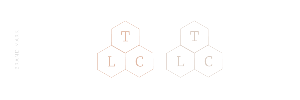
Brandmark
Also known as a submark, a brand mark is an illustration or a monogram design that stands in when your logo doesn’t fit. It’s meant to represent your brand in a minimal way when your primary or alternative logo becomes illegible. There are also some instances where you wouldn’t want to use your logo everywhere, otherwise, it would get tiring. A brandmark is an easy solution for that.
Where to use it? Social media avatar, watermarks on images, ink stamps, or even your website favicon!
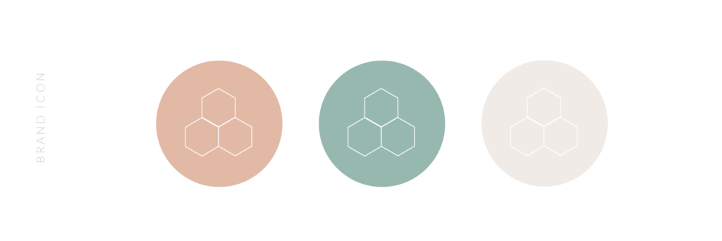
Brand Icon (or Favicon!)
Similar to your brand mark, your brand icon is an even more refined version of your logo. It could take just one element of your primary logo, such as a graphic element, or monogram, and be used informally.
You could also take it a step further and have icons designed that are tailored to your business. For example: if you own a coffee shop, you could have icons describing the coffee-brewing process (i.e. coffee beans, the temperature of the water, French pressed, packaging).
Where to use it? Website favicon, website footer, services webpage, and social media avatar.
Related post: How To Create A Strategic Moodboard
A key tip when working with a designer:
When you decide to work with a designer, make sure to always ask what logo variations and files they include with their branding packages. Long gone are the days when you would only want “just a logo”, it’s more important than ever to have variety in your branding so you stand out professionally and attract the right clients.
Important logo files and formats to ask for:
Web:
- PNG
- SVG
Print:
- JPEG
- EPS
Note that most of the time, designers will not provide native design files as the design are their property and copyright, so don’t be worried if they refuse to send over Illustrator files. However, with that said, it’s likely they would be willing to release them for a fee!
Bonus tip? Have a chat with them and see if they will include different colour versions of your logos, such as B&W of your primary and alternative logo, and brand marks with your brand colours.
As a brand designer and strategist, I always take a collaborative and human approach with my clients to develop a strong and timeless brand, with a primary logo and multiple variations depending on the client’s needs. If you are interested in branding or rebranding your business, I would love to hear from you!
LIKE THIS POST? SHARE & PIN IT!


YOU MIGHT LIKE THESE!
Paragraph
Shop Showit Website Templates
No Coding • Drag & drop • SEO optimized
Someday
Editorial, Edgy, Minimal
View demo
Joelle
Artistic, Striking, Refined
View demo
Beauté
Clean, Minimal, Refreshing
View demo
Designed By Yours Truly 🤍