Creating a Custom ‘Link-In-Bio’ Page in Squarespace
In today’s post, we will go over why it is waaaay more effective for your business and online traffic to create a custom ‘Link-In-Bio’ page in Squarespace, over third-party applications.
Today’s hack is a fun one! If you spend enough time on popular social media platforms like Instagram and Pinterest, you know how frustrating it can sometimes only be able to input one link on your profile at a time. It’s safe to say that small business owners and creatives often have multiple offerings, promotions, and content they want to showcase at once, so that limitation of having to choose which one is the most important just seems plain unfair! Lo, and behold — there is a solution.
Introducing: the “Link-In-Bio” page.
Third-party application companies, such as Linktree or Lnk.Bio, came up with a solution that allows users to embed multiple links using one access point. Users can now sign up for an account and use their platform to point their pages to the right destinations. Genius, right?
The downfall?
- The free plans are pretty basic, especially when it comes to branding and customization.
- It’s another platform you have to customize, familiarize yourself with, and depend on. (And if it crashes, you lost those leads!)
- On top of everything that you are already paying for your business, it can get pretty costly if you want to access their other features.
If you are someone like me who wants to streamline as much as possible with the existing tools and platforms that you are currently using, then I propose using your Squarespace website to host your “link-in-bio” page. Below is a step-by-step easy as 1-2-3 tutorial to help you do just that!
Determine Your Links
The first step is always planning! Work out where you want your audience to go and map out that journey. Think about your top 3-6 links that your ideal clients would most likely benefit from. For example:
- Your Services
- Your Portfolio
- Freebie of the Month / Featured Blog Post
- Your Process
These can be edited and updated as you please. I don’t suggest using more than 6 links because it will get a little too overwhelming to your ideal client. Remember the goal is to tease them enough and turn them into a lead! You will have plenty of time to dazzle and delight them once they are on your website or email list.
Related Post: Why Consider Squarespace If You Have A Service-Based Business
Setting Up Your Link-In-Bio Page
You want to head on over to your Page Panel and add a blank page under the “Not Linked” section. This way, it won’t show up in your navigation areas. Name your page along the lines of “Welcome”, “Links”, “Click Me” so that it’s welcoming and easy to find.
For example:
“Nice to meet you! Where would you like to go?”
“Choose Your Own Adventure Starts Right Below”
- “Where to next?”
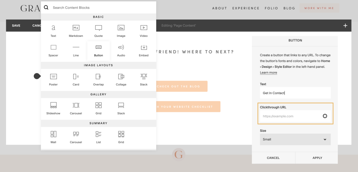
Next up, buttons! Your buttons will be the URLs that your ideal client will click on. As planned, insert 3-6 buttons by using the content blocks below your welcome message. I recommend using the small button option to keep the page nice and compact. Make sure to remember to enter the destination for your clickthrough URLs by inserting a page or web address, and clicking apply to confirm.
Brand It Out
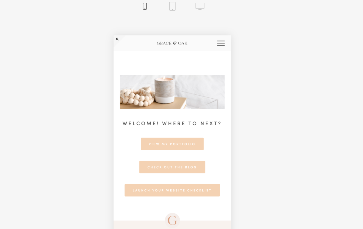
Once you have your buttons and links all saved, feel free to add a banner image or a photo of yourself to your page. However, I do suggest keeping everything as clean as possible since this page will most likely be viewed on mobile. Make sure to toggle the “view-as” settings at the top to see what the page will look like on mobile and tablet. If you aren’t doing this for the rest of your website, you definitely should!
Insert To Social Media Profiles
Alright, we are nearing the end. Once you are satisfied with the page, go back to your Page Panel on the left and click on the “wheel” of your page to ensure that you have customized the URL slug the way that you want.
Tip: I suggest naming your page and URL slug the same so that it’s easy to locate and identify in the future. Your URL slug is the second part of your site domain after the “/”. As an example, the “links” component is the URL slug: yourdomain.com/quick-links
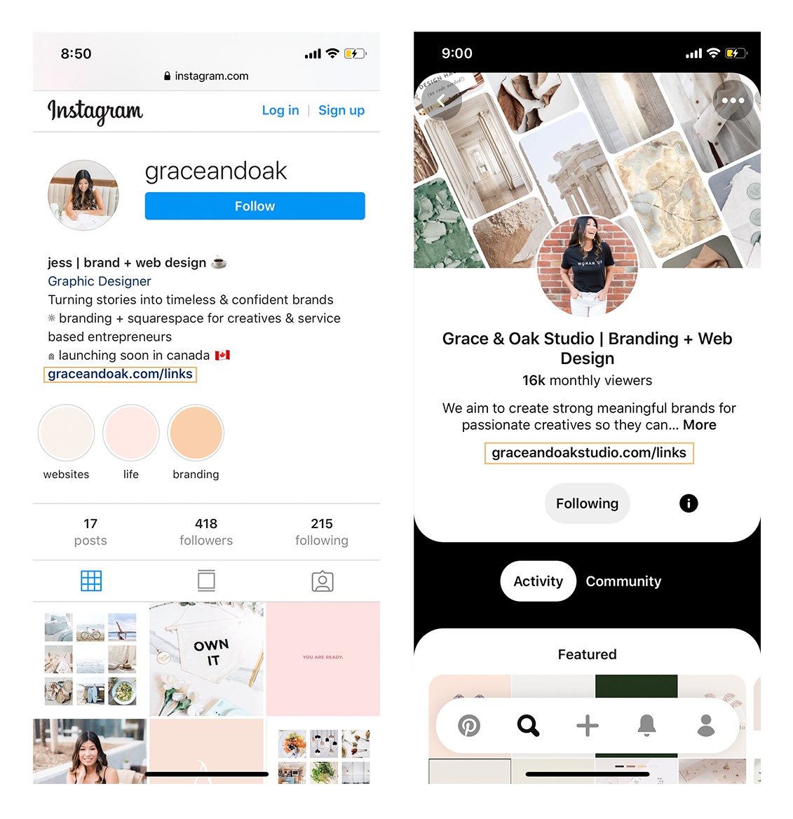
Next, log in to your social media accounts and insert the link (yoursiteurl.com/url-slug-here) accordingly.
Et, voila!
Bonus CSS snippets #1: TAKE OUT SITE HEADER & FOOTER (SQUARESPACE 7.0)
If you want to eliminate any distractions for your ideal client, you can always do so by removing the header and footer of your link-in-bio page. Don’t worry — it won’t affect the rest of your website.
Go back to your Page Panel > Instagram Links Page > Settings (wheel icon) > Advanced.
Paste this CSS snippet in the code injection box.
<style>
header, footer { display: none !important; }
.sqs-announcement-bar-custom-location { display: none !important; }
.Mobile-bar { display: none !important;}
</style>
Click save, then refresh your page!
Bonus CSS snippets #2: SAME BUTTON LENGTH
This one is a little bit more complex but so worth it. If you are a little particular like me, it’s probably driving you a bit crazy that your buttons aren’t the same length. Don’t worry, I got a CSS fix for you!
First and foremost, download this extension onto your Google Chrome browser: Squarespace Block Identifier. This will easily help you identify what block you are going to target your CSS with.
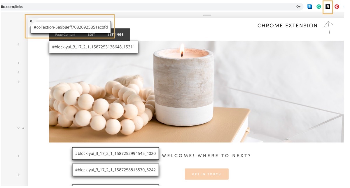
Now that you have it downloaded, the extension icon should appear as a black box with a B in it on the top right corner of your Chrome browser. Go back to your Instagram links page and click on the extension icon. A series of blocks with numbers and icons should pop up. Click on the top left one that starts with “collection-XXX”. It should automatically copy that series on your clipboard.
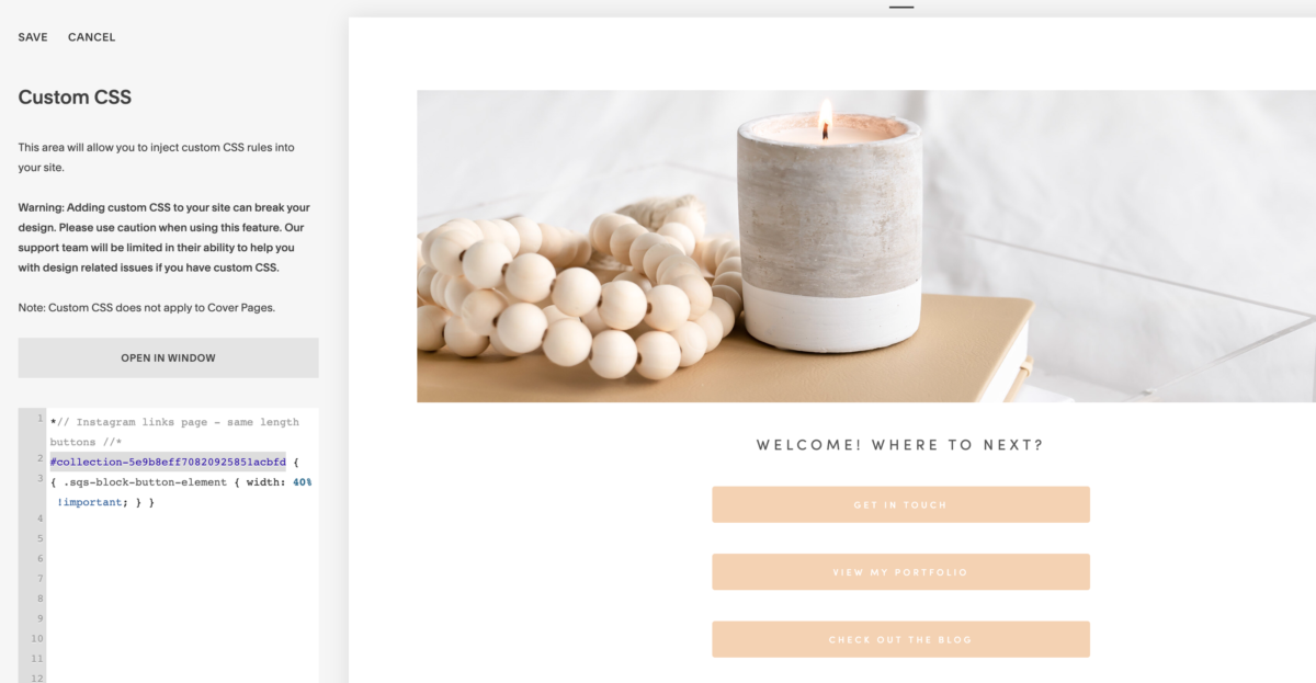
*// Instagram links page – same length buttons //*
INSERT COLLECTION ID {
{ .sqs-block-button-element { width: 40% !important; } }
You can adjust the “%” based on your preference. 30% – if you want it shorter, 50% + if you want it longer.
Click save, then refresh your page.
And there you have it! You now have a branded and effective “Link-In-Bio” page on Squarespace that’s easy to edit and maintain.
Let me know in the comments below if this was easy to follow or reach out to me via Instagram! Happy to answer any questions you might have.
LIKE THIS POST? PIN & SHARE IT!

YOU MIGHT LIKE THESE!
Paragraph
Calling all nutritionist coaches!
Meet The Full Sales Page Copy & Design Template Duo
Everything you need to finally launch your nutrition program with clarity, confidence, and personality. With copy fill-in-the-blanks, a drag-and-drop Showit template, and video walkthroughs, this is your done-with-overwhelm, ready-to-sell sales page template.
Shop Showit Website Templates
No Coding • Drag & drop • SEO optimized
Someday
Editorial, Edgy, Minimal
View demo
Joelle
Artistic, Striking, Refined
View demo
Beauté
Clean, Minimal, Refreshing
View demo
Designed By Yours Truly 🤍