


Boutique Fitness Studio Website Design for Bounce N’ Burn

One of the things I love most about working with wellness and fitness small businesses is that the work is never just about a website. It’s about energy and momentum. It’s about translating how something feels in real life into a digital space that actually motivates people to show up, move their bodies, and commit to themselves.
Bounce N’ Burn was one of those projects that I’m SO excited to share!
Sydney, the founder and rebounding instructor behind Bounce N’ Burn, reached out during a moment of transition. Like many studio owners, the pandemic had shifted how her classes operated. Fewer people were coming in person, while online workouts and memberships were becoming more popular — and more accessible — than ever. What she realized quickly was that this wasn’t just a temporary pivot but instead an opportunity…
👉🏼 An opportunity to reach a wider audience, create more flexibility for busy professionals, and introduce more people to rebounding: a workout that’s genuinely fun, effective, and still surprisingly niche in the online fitness space.
What she didn’t have yet was an online home that could support that vision… until now!!
From in-person classes to an online membership model
At the time, online fitness was already saturated with Pilates, yoga, and at-home workout platforms but rebounding wasn’t the most well-known. Sydney saw this as a potential opportunity — she wasn’t just launching another membership; she was introducing people to a workout that feels fun and energizing, while still delivering real results.
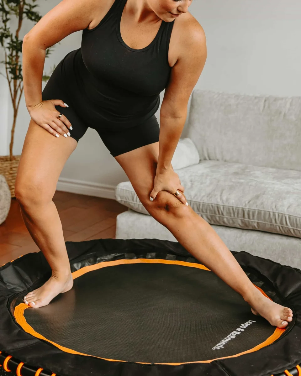
In case you aren’t familiar (like me a few years ago), rebounding is a low-impact workout that improves endurance and balance while supporting the lymphatic system — all without putting unnecessary strain on your joints. That balance between effectiveness and enjoyment is what makes it so compelling, and it’s exactly what I knew needed to be reflected in the brand itself.
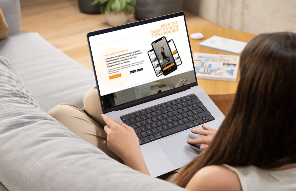
This couldn’t look or feel like a typical fitness website. The digital experience needed to communicate credibility and playfulness, showing people that this is a serious workout they’ll actually want to come back to.
Choosing the Right Platform for a Boutique Fitness Studio Website
From the beginning, this project was about building something sustainable: not just visually, but operationally.
We chose the Squarespace website platform intentionally. For a boutique fitness studio owner, it offered exactly what Sydney needed: a clean, flexible platform that’s easy to update, customizable from a design perspective, and powerful enough to grow with her business.
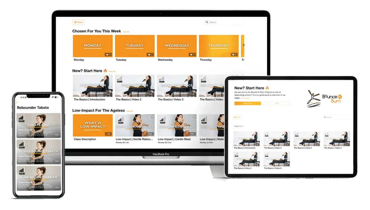
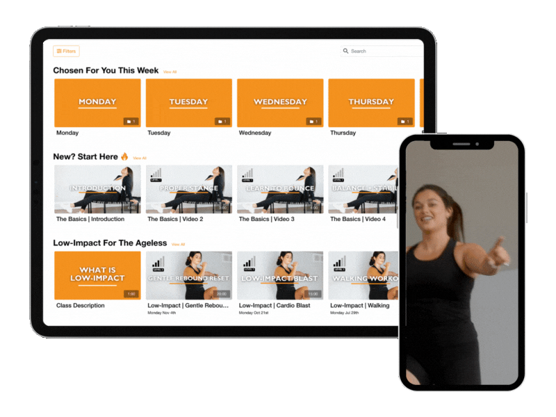
Squarespace also integrates seamlessly with Arketa, which we used as the class scheduling and membership platform. Arketa is a fantastic, affordable option for smaller studios and independent instructors. It’s intuitive, easy for clients to use, and allows you to embed key features directly into your website: on-demand classes, pricing and memberships, app login, fitness challenges, and more.
The goal was to make the website feel like a true one-stop shop. Everything lives in one place, and if Sydney ever decides to switch booking platforms in the future, her website won’t disappear with it. That flexibility matters more than people realize.
Rethinking what a fitness studio website should feel like
Most fitness studio websites tend to fall into one of two camps: dated and template-heavy, or polished but generic. In both cases, the result is the same: the brand gets diluted, and the site does very little beyond listing workout classes.
For Bounce N’ Burn, that approach wouldn’t necessarily work. Rebounding is still unfamiliar to many people, so the website needed to do more than list information. It needed to spark curiosity, communicate energy, and give visitors an immediate sense of what it would feel like to take a class.
Before thinking about structure or conversion, I decided to focus on the feeling first. The site needed to feel dynamic, fun, and alive — a reflection of the energy Sydney brings to her workouts. That clarity around how the brand should feel became the foundation for every visual decision that followed.
Bringing the brand to life online
Sydney already had a logo designed by another graphic designer, but my role was to bring it to life digitally in a way that matched the energy she brings to her classes.
The website leans heavily into orange and black: a bold, high-contrast palette designed to grab attention and move away from the typical neutral, white-heavy wellness aesthetic. It immediately signals that this isn’t a slow, quiet workout experience. It’s dynamic, fun, and high-energy!!
From there, I layered in movement and playfulness to make the brand stand out:
- A bouncing logo animation that introduces the site for first-time visitors
- A custom circular cursor to echo the shape of a rebounder (obvs)
- Bounce animations on select words and phrases to mimic the workout itself
- Wavy motion elements to create rhythm and flow
- Circular imagery throughout to reinforce the rebounding theme
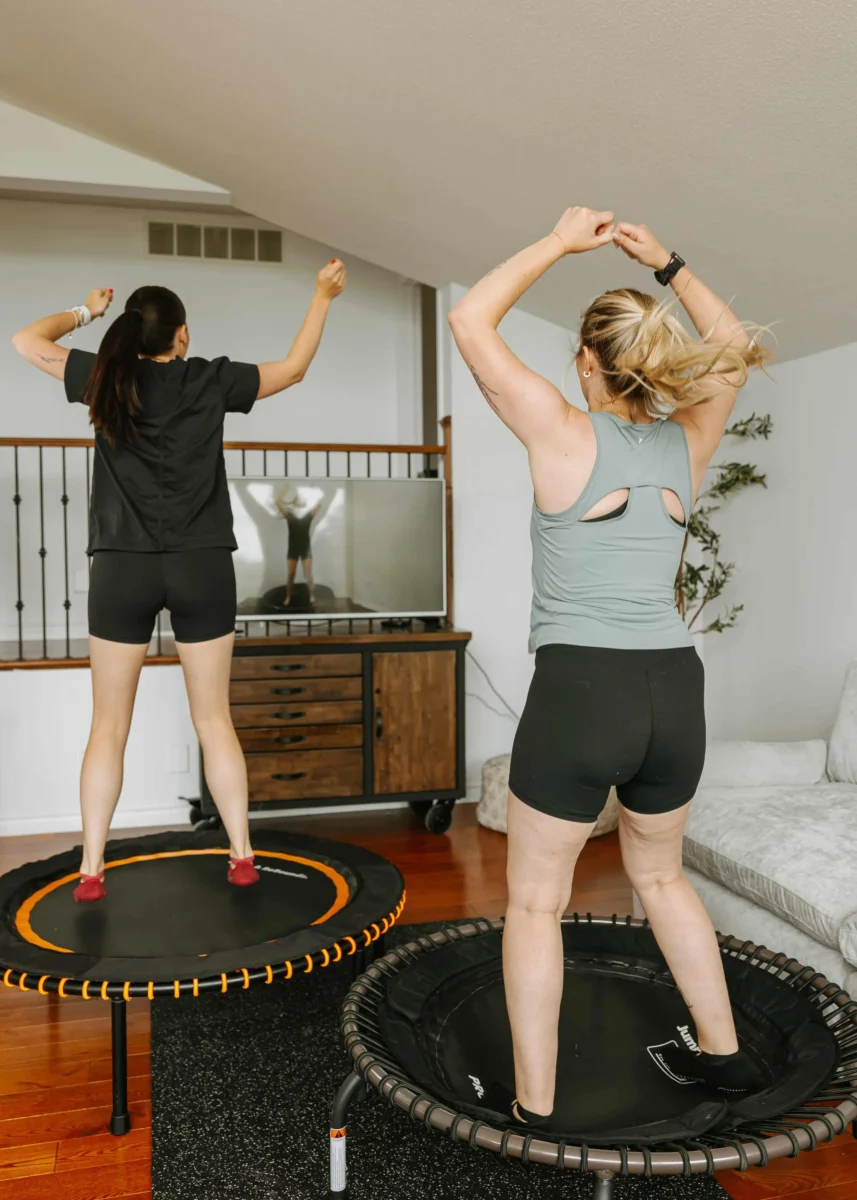
Because rebounding is such a niche workout, stock imagery alone wasn’t going to cut it. We were intentional about using photos and videos that tell a story — helping visitors see themselves on the site, on their laptop, jumping into a class and getting started easily from home.
Related Post: Why Work With A Website Designer When Planning A Brand Photoshoot
Designing for trust, connection, and conversion
When I design websites for fitness and wellness businesses, I think carefully about how someone moves through the experience: how quickly they understand the offering, how supported they feel, and how easy it is to take the next step.
With Bounce N’ Burn, trust was built through clarity and presence. Visitors needed to understand what rebounding is, how the workouts work, and who they’d be learning from. From there, the experience was intentionally simplified. Because many returning members already book through the app, the website’s primary role wasn’t scheduling, and instead was conversion.
The focus became guiding new visitors toward a 5-day free trial with as little friction as possible: Social media marketing guides visitors to the website, then to the free 5-day trial, and the trial introduces the app and membership options. Nothing is overcomplicated and nothing feels forced. The site simply leads people where they’re ready to go.
Thinking about your own studio website?
If you’re a studio owner, Pilates instructor, or wellness professional who’s expanding into online classes or memberships, your website plays a much bigger role than simply listing classes! It sets expectations. It builds trust. And it either supports your growth or quietly works against it.
I design boutique fitness studio websites for wellness professionals who want a digital home that reflects their energy, supports how their business actually operates, and helps turn curious visitors into committed members.
If your current site feels dated, disjointed, or no longer aligned with where your business is headed, it might be time to consider a rebrand or website refresh! Reach out below to book a complimentary discovery call to see how I can help!
★★★★★
“After a burst of motivation that came along with a ton of hesitation and intimidation, I sent Jess a DM begging for website help. After some convincing that its a worthy investment, I invested in her website design package to have her help in re-branding my entire business and develop a website that will make it easier for my fitness program to be accessible virtually. From our first kick-off call, Jess made a point to hear me out, see my vision and do her best to bring it to life. After a few short weeks, she did just that. It’s perfect. I can’t thank her enough, she brought my vision to life and helped me so much. If I can say anything, it’s take the leap. make the investment, it’s worth it!”
— Sydney, Rebounding Instructor & Fitness Studio Owner
Paragraph
Calling all nutritionist coaches!
Meet The Full Sales Page Copy & Design Template Duo
Everything you need to finally launch your nutrition program with clarity, confidence, and personality. With copy fill-in-the-blanks, a drag-and-drop Showit template, and video walkthroughs, this is your done-with-overwhelm, ready-to-sell sales page template.

Shop Showit Website Templates
No Coding • Drag & drop • SEO optimized

")
Someday
Editorial, Edgy, Minimal
View demo

Joelle
Artistic, Striking, Refined
View demo


Beauté
Clean, Minimal, Refreshing
View demo


Designed By Yours Truly 🤍
